
Introduction:
Conversion-focused web design is the difference between a website that wins business and one that simply looks impressive. In today’s hyper-competitive digital landscape, Canadian businesses — from Vancouver startups to Toronto-based enterprises — are discovering that aesthetic appeal without strategic intent is an expensive mistake. A stunning homepage that fails to guide visitors toward a clear action is not a marketing asset. It is a liability.
Most websites are built around visual preference. Designers choose colors, layouts, and typography based on brand identity alone, without asking the most important question: does this move the user toward a decision? The result is predictable — high traffic, low revenue, and conversion rates that rarely exceed 2% on sites built without CRO design principles.
The brands that grow consistently share one thing in common. They treat every element of their website as a tool within a carefully engineered sales funnel. They apply UX psychology to understand how visitors think, feel, and behave. They run usability testing to eliminate friction before it costs them leads. They use interface optimization not to create beauty for its own sake, but to reduce hesitation and accelerate trust.
The numbers support this approach decisively. According to Forrester Research, every $1 invested in UX returns $100 on average — a 9,900% ROI. For Canadian businesses competing in saturated markets, that figure is not theoretical. It reflects real revenue recovered from websites that stopped guessing and started measuring.
“Too many businesses pour money into gorgeous websites that look impressive but fail at their actual job – turning visitors into customers. A website might win design awards but lose sales every single day. This happens because most designers focus on aesthetics first and conversions second.(atechnocrat)”
This article breaks down why conversion-focused web design consistently outperforms visually-driven but strategically empty websites — and how Zerotens builds digital experiences that turn visitors into customers.

Conversion-Focused Web Design — Where Art Meets Analytics
Great design has always required creativity. What separates high-performing websites from forgettable ones in 2026 is the discipline of pairing that creativity with hard data. Conversion-focused web design does not reject aesthetics — it subordinates them to measurable outcomes. Every color choice, every button placement, every headline is evaluated not just by how it looks but by what it produces.
The most successful digital brands in Canada operate with this mindset from day one. They do not launch a website and then wonder why traffic fails to convert. They build conversion architecture into the foundation — mapping user journeys, identifying decision points, and engineering each page to reduce resistance and amplify intent. The result is a digital experience that feels intuitive to users while systematically moving them toward a goal.
Analytics are not an afterthought in this process. Tools like Google Analytics 4, Hotjar, and Microsoft Clarity reveal exactly where users drop off, which sections hold attention, and which calls to action generate clicks. This data transforms web design from a subjective discipline into a precise growth engine — one that Canadian businesses can trust to deliver consistent, scalable results.
The Data Behind Every Design Decision
Data-driven design begins before a single wireframe is drawn. At Zerotens, every project opens with a discovery phase that examines existing traffic patterns, heatmap behavior, scroll depth, and bounce rates. These metrics expose the gap between what a business assumes users want and what users actually do.
Consider a Vancouver-based e-commerce brand that invested heavily in a visually rich product page. Heatmap analysis revealed that 74% of users never scrolled past the hero image — meaning the pricing, trust signals, and add-to-cart button were invisible to the majority of visitors. One interface optimization — moving the CTA above the fold — produced a 31% lift in conversions within 3 weeks.
This is the power of designing with data. It removes opinion from the equation and replaces it with evidence. Every font size, whitespace decision, and color contrast ratio is justified by user behavior — not personal preference or design trends. In competitive Canadian markets where customer acquisition costs continue to rise, this precision is not optional. It is the foundation of sustainable digital growth.
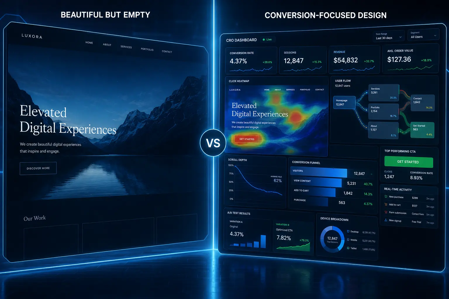
Conversion-focused web design dashboard showing CRO analytics heatmaps and user behavior metrics.
How Analytics Shape Every Pixel on Your Page
Interface optimization at the pixel level sounds granular because it is. Conversion-focused design teams analyze micro-interactions — how users respond to hover states, loading speeds, form field sequences, and error messages. Each of these touchpoints either builds momentum toward conversion or introduces friction that kills it.
Canadian businesses operating in bilingual markets face an additional layer of complexity. English and French user behavior patterns differ in measurable ways — from reading direction tendencies to trust signal preferences. Zerotens accounts for these regional nuances during the usability testing phase, ensuring that interface decisions reflect the actual behavioral patterns of the target audience rather than global averages.
Page speed is another data-driven priority. Google’s Core Web Vitals research confirms that a one-second delay in page load time reduces conversions by 7%. For a Canadian business generating $500,000 in annual online revenue, that single second costs $35,000 per year. CRO design addresses performance at the code level — optimizing image compression, eliminating render-blocking scripts, and streamlining server response times to keep users engaged and moving forward.
Every pixel, in this framework, has a job. And data is the only reliable way to know whether it is doing that job.
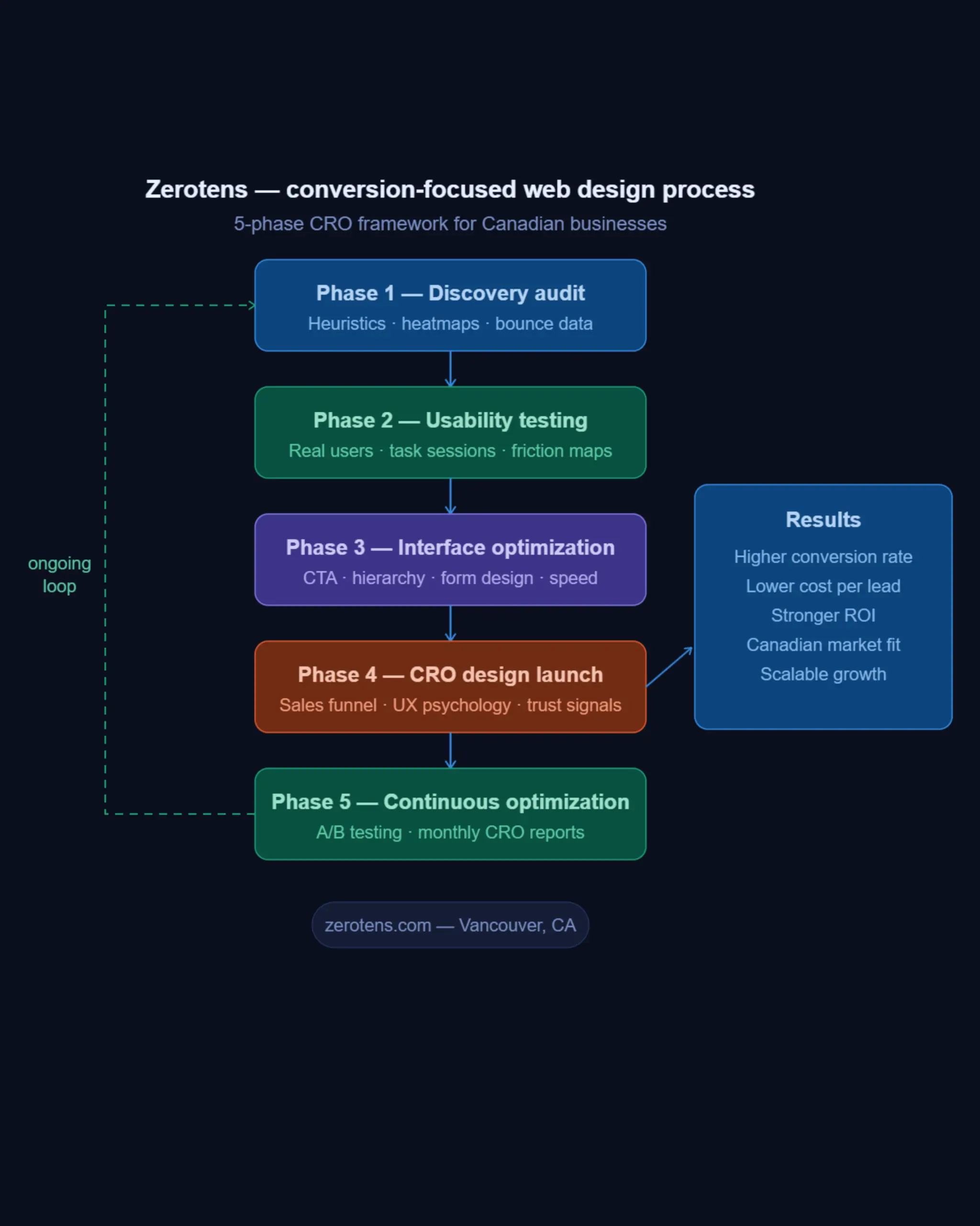
Zerotens’ scalable web development stack , from PWA frontend through to cloud-optimized Canadian infrastructure.
Why Conversion-Focused Web Design Outperforms Visual-Only Layouts
Beautiful websites lose money every day. This is not a provocative claim — it is a measurable pattern that repeats across industries, markets, and budget levels. A visually stunning website that lacks strategic structure sends the wrong signal to the human brain: it creates admiration without direction. And admiration, without a clear next step, rarely becomes a transaction.
Visual-only design prioritizes the approval of the client over the behavior of the customer. It optimizes for the moment the website launches — the reveal, the applause, the social media post — rather than the months and years of conversion performance that follow. Canadian businesses that have invested significant budgets into award-winning designs frequently discover that their bounce rates remain high, their session durations stay short, and their contact forms stay empty.
The core problem is architectural. Websites built around visual impact arrange elements for harmony and balance. Websites built around conversion-focused web design arrange elements around the user’s decision-making journey. These are fundamentally different objectives — and they produce fundamentally different results. One creates impressions. The other creates revenue.
Research from the Baymard Institute found that 69.8% of online shopping carts are abandoned before purchase. The primary drivers are not price or product quality — they are UX failures: unexpected costs, complicated checkout flows, unclear trust signals, and confusing navigation. These are interface problems. And they are entirely solvable through CRO design.
The Psychology Behind Persuasive Design
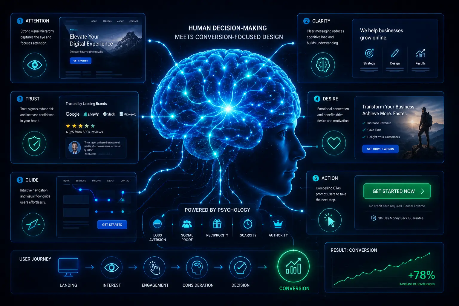
Human behavior online is not rational. Visitors do not read websites — they scan them. They make trust decisions within 50 milliseconds of landing on a page. They respond to visual hierarchy, color psychology, and social proof in ways that bypass conscious analysis entirely. Understanding this is the foundation of UX psychology applied to web design.
Persuasive design works by aligning the website’s visual language with the brain’s natural decision-making shortcuts — what behavioral economists call heuristics. When a call-to-action button uses a high-contrast color that draws the eye, that is not an aesthetic choice. It is a psychological trigger engineered to reduce cognitive load and direct attention. When testimonials appear directly beside a pricing table, that placement is deliberate — it addresses the precise moment of hesitation with social proof.
Zerotens applies these principles systematically across every project. The Fitt’s Law principle informs button sizing and placement — larger, closer targets get clicked more often. The Von Restorff effect guides how key offers are visually isolated to trigger memory and attention. Hick’s Law shapes navigation architecture — fewer choices reduce decision fatigue and accelerate user momentum through the sales funnel.
For Canadian businesses targeting both local and international audiences, UX psychology must account for cultural context. Color associations, trust indicators, and social proof formats vary between markets. A red urgency badge that converts strongly in North American e-commerce may carry different associations for international visitors. Usability testing across audience segments ensures that psychological triggers land correctly — regardless of where the visitor originates.
When Beautiful Websites Quietly Lose Revenue
The financial cost of visual-only design rarely appears on a single invoice. It accumulates silently — in abandoned carts, unanswered contact forms, and paid traffic campaigns that generate clicks but not customers. By the time a business recognizes the pattern, months of marketing budget have been spent driving visitors to a website that was never equipped to convert them.
Consider the typical scenario facing a Vancouver professional services firm. Their website is polished, modern, and visually consistent with their brand. It ranks on page 2 of Google for their primary keyword. Their Google Ads campaign drives 3,000 visitors per month at a cost of $8,000. Their conversion rate is 0.8% — producing 24 leads per month at a cost of $333 per lead.
A conversion-focused redesign — focused on interface optimization, clearer service positioning, stronger social proof, and a simplified contact flow — raises that conversion rate to 3.2%. The same 3,000 visitors now produce 96 leads per month. The cost per lead drops from $333 to $83. The marketing budget did not change. The traffic did not change. The design changed — and the revenue impact is immediate and compounding.
This is the business case for CRO design. Not theory. Not aesthetics. Measurable, attributable, scalable revenue growth — built into the structure of every page, every section, and every pixel of a strategically engineered website.
The Core Elements of a High-Converting Website
Understanding why conversion-focused web design outperforms visual-only layouts is one thing. Building it is another. High-converting websites share a precise set of structural and psychological elements that work together as a system — not as isolated design choices. Remove one element and the system weakens. Align them correctly and conversion-focused web design becomes a self-reinforcing revenue engine that compounds results over time.
Canadian businesses that partner with Zerotens discover that the most impactful changes within a conversion-focused web design framework are rarely the most dramatic ones. A revised headline, a repositioned trust signal, a simplified form — these micro-decisions, grounded in usability testing and behavioral data, consistently outperform full visual redesigns that leave the underlying conversion architecture untouched.
The 6 core elements below form the foundation of every conversion-focused web design Zerotens builds and optimizes for clients across Vancouver, Toronto, Calgary, and beyond.
Interface Optimization That Guides User Behavior
Interface optimization is the discipline of arranging digital elements so that users move through a conversion-focused web design with minimal friction and maximum momentum. It is not about making things look cleaner — it is about making the right action feel effortless and the wrong action feel unnecessary.
Visual hierarchy is the first lever every conversion-focused web design must get right. Every page communicates a priority — the single most important action the user should take. Whether that is booking a consultation, starting a free trial, or requesting a quote, visual hierarchy ensures that action dominates the page visually. Size, contrast, whitespace, and positioning all contribute to this signal. When hierarchy is absent, users experience decision paralysis — and paralyzed users leave without converting.
Navigation architecture is the second lever. Zerotens applies Hick’s Law rigorously across every conversion-focused web design project — every additional navigation option increases the time users take to make a decision. Canadian e-commerce brands that reduce their primary navigation from 9 items to 5 typically see session depth increase and exit rates drop within the first 30 days. Simplicity is not a design preference. It is a conversion strategy.
Form design is the third lever and one of the most underestimated components of conversion-focused web design. Research from HubSpot confirms that reducing a contact form from 11 fields to 4 fields increases submissions by 120%. Every additional field is a question the user must answer before receiving value — and each question introduces a moment where they can decide the effort is not worth it. Zerotens designs forms around the minimum viable ask — collecting only what is essential at first contact and gathering additional data progressively as the relationship develops.
Mobile interface optimization is non-negotiable in any conversion-focused web design strategy in 2026. Over 63% of Canadian web traffic originates from mobile devices, according to Statista. A desktop-optimized website that renders poorly on a smartphone is not a minor inconvenience — it is a direct, measurable revenue leak. Touch target sizing, thumb-zone navigation, and mobile-specific CTA placement are standard components of every Zerotens interface optimization audit.
Sales Funnels Built Around Buyer Psychology
A sales funnel is not a marketing metaphor. Inside a conversion-focused web design, it is a literal architectural decision — a deliberate sequence of pages, sections, and interactions engineered to move a visitor from awareness to action in the shortest path possible.
Zerotens maps every client’s sales funnel before designing a single page of their conversion-focused web design. This mapping process identifies 3 critical user states: the visitor who has never heard of the brand, the visitor who is actively comparing options, and the visitor who is ready to act but needs one final confidence signal. Each state requires different content, different visual treatment, and different calls to action.
For Canadian B2B companies — a significant segment of Zerotens’ client base in Vancouver and across British Columbia — the conversion-focused web design framework must account for multi-session, multi-stakeholder journeys. A CEO may discover the brand through a blog post. A marketing director may evaluate the service page. A procurement officer may scrutinize the case studies. Each touchpoint must be engineered to serve its specific role in the funnel without creating confusion or contradiction.
UX psychology shapes every stage of this conversion-focused web design funnel. At the awareness stage, content leads and conversion asks are soft — newsletter sign-ups, downloadable resources, educational blog content. At the consideration stage, social proof intensifies — client logos, detailed case studies, measurable results. At the decision stage, friction disappears entirely — clear pricing, simple contact flows, strong guarantees, and immediate response commitments.
Usability testing validates each funnel stage against real user behavior. Zerotens runs moderated and unmoderated sessions with representative Canadian users, capturing where comprehension breaks down, where trust wavers, and where momentum stalls. These insights feed directly back into conversion-focused web design optimization cycles — creating a continuous improvement loop that keeps conversion rates climbing long after launch.
The result is a conversion-focused web design that does not rely on a visitor’s patience or persistence. It anticipates their questions, addresses their hesitations, and delivers them to a conversion point with confidence — because every element of the journey was engineered with that single outcome in mind.
Zerotens’ Proven Process for Conversion Optimization Through UX
Most agencies build websites. Zerotens builds conversion-focused web design systems — repeatable, data-validated frameworks that remove guesswork from every stage of design and optimization. For Canadian businesses tired of paying for traffic that never converts, this process delivers measurable results from day one.
Usability Testing as a Growth Engine
Every conversion-focused web design project at Zerotens begins with a structured usability audit — not creative brainstorming. The team runs heuristic evaluations against Nielsen Norman Group’s 10 usability principles, identifying interface failures ranked by their direct impact on conversion rate.
Behavioral data follows immediately. Hotjar heatmaps, Microsoft Clarity session recordings, and Google Analytics 4 funnel reports reveal exactly where Canadian visitors drop off, hesitate, or misclick. For one Vancouver SaaS client, this analysis uncovered that 61% of homepage visitors clicked a decorative, unlinked image — a single usability testing insight that redirected the entire interface optimization strategy and lifted demo requests by 28% within 6 weeks.
Real-user testing completes the picture. Zerotens recruits participants from the client’s actual target market, running structured task-completion sessions that surface friction no analytics tool can detect — confusing microcopy, weak trust signals, CTAs that create hesitation instead of confidence.

CRO Design Applied to Canadian Businesses
Conversion-focused web design in Canada requires more than global best practices. Canadian buyers demand higher trust thresholds — transparent pricing, local social proof, and regional credibility signals — before submitting a form or initiating a purchase. Zerotens builds these signals into every conversion-focused web design at the structural level.
Local trust markers — Canadian client logos, area-code phone numbers, region-specific case studies — consistently outperform generic alternatives in usability testing. For Vancouver businesses serving both local and international audiences, Zerotens balances global credibility with local authenticity to maximize conversions across all visitor segments.
Post-launch, conversion-focused web design optimization continues monthly. A/B testing, CRO design refinements, and interface optimization cycles ensure performance compounds long after the site goes live — because a website that converts today must evolve to convert tomorrow.
FAQ — Conversion-Focused Web Design Explained
1. What is conversion-focused web design? Conversion-focused web design is a strategic approach that builds websites around measurable user actions — clicks, form submissions, purchases — rather than visual appeal alone. Every element is engineered to guide visitors toward a specific goal using data, UX psychology, and interface optimization.
2. How does UX impact sales and conversions? UX directly determines whether visitors stay or leave. Poor usability testing results in friction — confusing navigation, slow load times, unclear CTAs — that silently kills conversions. Strong UX removes those barriers, shortens the path to purchase, and builds the trust Canadian buyers need before committing.
3. What tools track website user behavior? The most effective tools include Hotjar for heatmaps and session recordings, Google Analytics 4 for traffic and conversion data, and Microsoft Clarity for click and scroll behavior. Together they power intelligent CRO design decisions grounded in real user evidence — not assumptions.
4. Can design alone boost ROI? Yes — measurably. Forrester Research confirms every $1 invested in UX returns $100. For Canadian businesses, conversion-focused web design improvements — clearer CTAs, simplified forms, stronger trust signals — consistently deliver ROI without increasing ad spend or traffic volume.
5. How does Zerotens implement CRO design? Zerotens runs a 4-phase process: heuristic evaluation, behavioral data analysis, real-user usability testing, and continuous post-launch optimization. Every interface optimization decision is backed by data — ensuring conversion-focused web design delivers compounding results across every Canadian market Zerotens serves.
Conclusion
Conversion-focused web design is not a trend — it is the new standard for Canadian businesses serious about digital growth. In a market where attention is scarce and acquisition costs rise every quarter, the difference between a website that converts and one that merely exists is entirely architectural. Visual appeal earns attention for seconds. Strategic design earns revenue for years.
Zerotens builds websites that work as hard as the businesses behind them — combining CRO design, UX psychology, interface optimization, and continuous usability testing into a single, data-driven growth system. The result is not just a better-looking website. It is a measurable, scalable revenue engine built specifically for the Canadian market.
If your website is attracting traffic but failing to convert it, the problem is not your product — it is your conversion-focused web design. And that is exactly what Zerotens fixes.
Let’s Build Something Smarter Together → zerotens.com/contact-us